- Published on
Is Your App Ready for Foldable Phones?
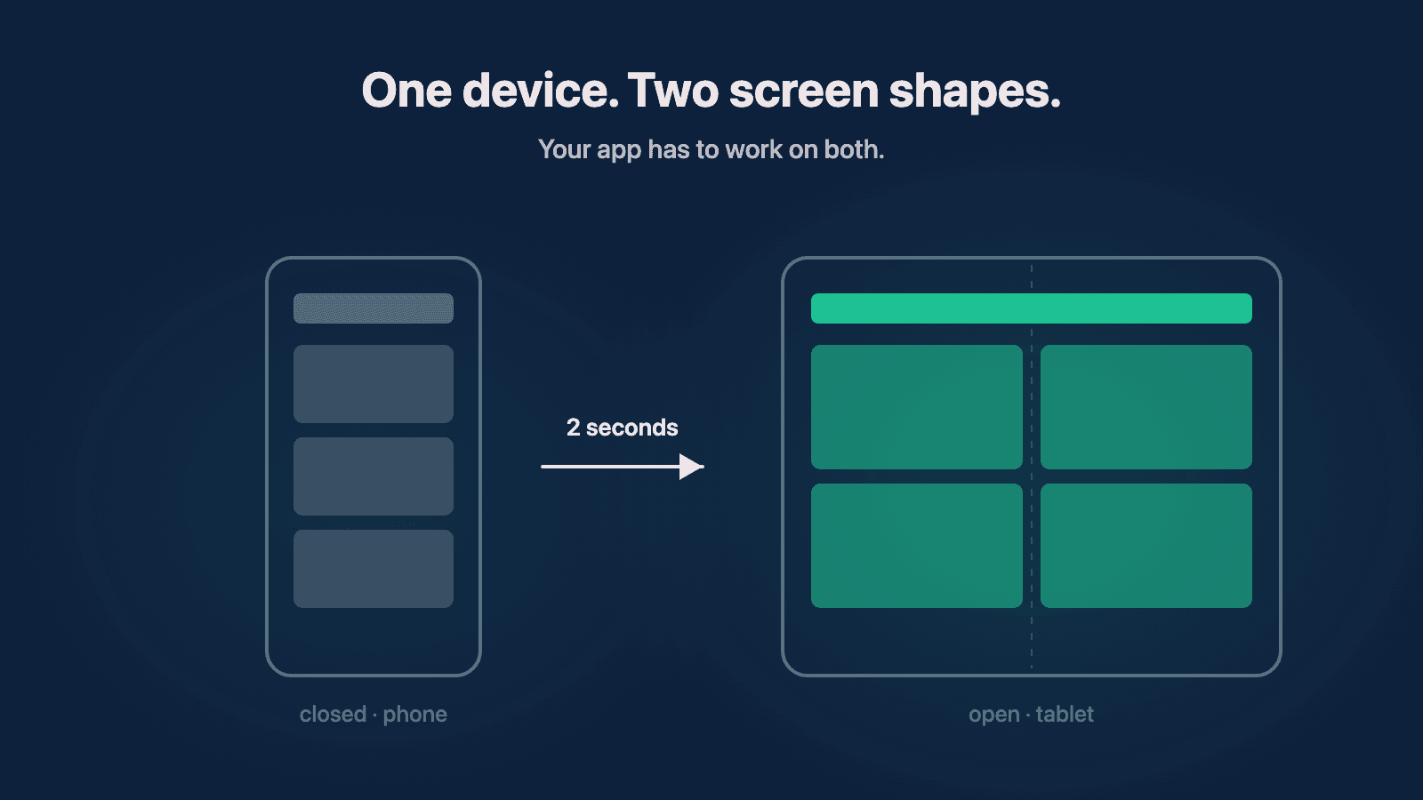
The last couple of weeks have been pretty exciting in the mobile world. Samsung released the Galaxy Z Fold 8 and Z Fold 8 Ultra, and demand surprised everyone — including Samsung, which is now producing an extra one million units because pre-orders blew past what they planned for. And Apple, the company that resisted foldables the longest, is expected to announce its own in September.
I've been testing foldables since the Galaxy Z Fold 4, and I went and tried the Z Fold 8 at Best Buy this past week. I want to talk about what's changed, and why I think this matters for anyone who owns an app — not just the developers building them.
Here's the short version: foldables are moving from a niche gadget to a mainstream category, and both Apple and Google have already changed their platform rules so that apps are expected to adapt to any screen size. If your app is designed around one fixed phone shape, a growing slice of your customers is going to open it on a device where it looks broken. And they won't know whose fault that is — they'll just know your app looks bad.
Why I kept returning foldables
I bought my first foldable when the Galaxy Z Fold 4 came out, and I returned it within a day. The idea was great — a phone when you need a phone, a tablet when you want to read or play a game. But the cover screen felt too narrow to type on, so I'd open it up to text, and then my thumbs were on opposite ends of a tablet and the keyboard was worse. Little nuances like that, over and over. I remember thinking: good phone, just not for me. I'd rather carry a phone and a tablet separately.
The Google Pixel Fold, a couple of years later, got closer. Closed, it felt like an actual phone. Open, I had the screen real estate I wanted. But apps didn't always behave. I was at a Google demo store in Chicago playing a game on one, something rendered wrong, and I asked the employee whether it was a Pixel problem or a game problem. He looked at me and said, "I have no idea."
That moment stuck with me, because as an app developer I genuinely couldn't tell either. My best guess was the app hadn't been built to handle that screen. But here's the thing that matters if you own an app: the user can't tell whose fault it is, and mostly they don't care. The app is what looks broken.
What changed with the Z Fold 8
When I tested the Z Fold 8, the thing I expected to hate — the wider, shorter cover screen — turned out not to bother me at all. I set it right on top of my iPhone 16 Pro Max (I don't use a case, so this was easy) and closed, it wasn't much wider than my phone. Typing was actually better than on my Pro Max or my Galaxy S24+, because the keyboard finally has room.
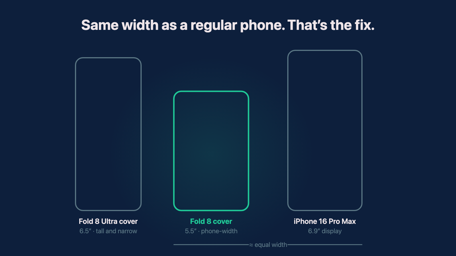
Cover screens drawn to scale from published display specs. The Fold 8's cover screen works out to almost exactly the width of an iPhone 16 Pro Max — just shorter.
Open, it looks like an iPad mini. I watched videos both open and closed, and there just weren't the thick black bars I remember from the Fold 4 and the Pixel Fold.
What made the comparison easy is that Samsung is selling both shapes side by side this year. The Fold 8 Ultra keeps proportions close to the older Folds — very familiar territory from my Fold 4 days — while the regular Fold 8 is the new, wider design. I went back and forth between the two at the demo table, and for me the new shape was the whole ballgame. The market seems to agree: the Z Fold 8 pulled around 30% more pre-orders than the Fold 7, enough that Samsung had to add a million units to the production plan.

The Fold 8 Ultra (left) keeps the taller shape; the Fold 8 (center) goes wider. Photo: Dinkun Chen, CC BY-SA 4.0, via Wikimedia Commons.

I'd still argue there are kinks to work out. I've seen videos of apps that break on the shorter cover screen because they were designed for one exact aspect ratio. But that's not a Samsung problem or an Android problem. That's apps that were never built to be responsive, meeting hardware that no longer forgives it.
And to be clear about my own position: I still wouldn't buy one outright. I don't trust any folding hinge or inner screen to be perfect a year in, so if I made one my daily driver I'd lease it — which just got easier, since Apple now offers device leasing through Klarna starting at $17.99 a month. The fact that there's now a low-commitment way into a $2,000 folding phone is itself part of why this category is about to get bigger.
Why do foldables suddenly matter for your app?
Samsung has been shipping foldables since the first Galaxy Fold in 2019, so it's fair to ask why now is different. Three things stacked up at once.
First, the hardware finally crossed the line where normal people want it, and the production increase is the receipt. Second, Apple is entering. When Apple adopts a form factor, its developer ecosystem follows fast, and the rumored September announcement means iPhone users — probably including some of your customers — will be unfolding their phones within months. Third, and this is the part almost nobody is talking about: both platforms have already rewritten their rules so that apps must adapt.
What are Apple and Google actually requiring?
This is the part I'd want every app owner to understand, because it's not a trend prediction. It's already in the documentation.
On Apple's side, the old escape hatch — a setting called UIRequiresFullScreen that let an iPad app lock itself to one fixed size — is deprecated, and as of iPadOS 26 the system ignores it. Apps are expected to handle being resized to whatever window the user wants. With iOS 27 this year, Apple went further: iPhone apps themselves are now expected to support resizing, and Apple shipped a resizable Simulator in Xcode 27 so developers can drag an app through arbitrary sizes and watch it adapt. People noticed that the resizability push looks a lot like preparation for a folding iPhone. I noticed it too, about a year and a half ago when the iPad requirement first appeared in Apple's docs, and it's part of why I started making my own apps responsive before this year forced the issue.
On Google's side it's even more direct. For apps targeting Android 16, the platform ignores orientation and resizability restrictions on large screens — tablets, and the inner screens of foldables. Your app gets resized to fill the screen whether it was designed for that or not. There's a temporary opt-out, and it goes away with Android 17.
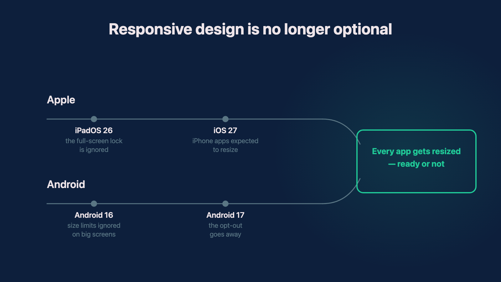
Both platforms converge on the same rule: apps adapt, or the system resizes them anyway.
So the question is no longer whether your app should adapt to different screen sizes. Both platforms have decided it will be resized. The only open question is whether it looks intentional when that happens.
What does a non-responsive app cost you?
Think about Instagram. For fifteen years, using Instagram on an iPad meant a blown-up phone app with black bars, and it became a running joke until a real iPad app finally shipped in late 2025. Instagram could afford that, because it's Instagram. Your app probably can't.
What I keep coming back to is the moment I saw on that Pixel Fold in Chicago: a user, a broken layout, and no way to know who's responsible. On a foldable that moment happens constantly, because the user is switching between two screen shapes all day. When I owned foldables, that was the whole appeal — scrolling closed on the couch, then opening it up two seconds later because a game or a video deserved the big screen. If your app handles one of those shapes and not the other, the user hits the bad version of your app several times a day.
It used to take someone minutes to move from their phone to their tablet, if they bothered at all. Now it takes two seconds, inside one device, mid-session. That's a genuinely new expectation for apps to meet, at least on iPhone — Android users have technically had it for seven years, but the sales numbers say it's about to stop being a niche behavior.
What should you ask your development team?
If you own an app, or you're about to have one built, I'd ask four questions.
Does our app use responsive layout, or fixed sizes? Modern toolkits — SwiftUI on iOS, Jetpack Compose on Android, React Native on both — are built to adapt, but only if they're used that way. Plenty of apps built in the last five years hard-code assumptions about one screen shape.
Do we actually test on foldable and tablet sizes? Testing this no longer requires buying every device. Apple's resizable Simulator and Android Studio's resizable emulator exist precisely so a developer can drag your app through every size in minutes. If your team has never done that pass, that's worth knowing.
What happens at the moment the phone unfolds? This is the foldable-specific case: your app is running, and the screen it lives on suddenly doubles. Apps that handle a cold launch on a tablet fine can still lose state or break layout on that live transition.
And what happens when we update our target OS version? On Android especially, the behavior change arrives when your app targets Android 16 — so a routine dependency update can be the moment your locked-portrait app starts getting stretched across an 8-inch screen. Better to find that out on purpose. This is exactly the kind of thing a technical audit surfaces before your users do, and if you're starting fresh, it's a reason to make responsive design part of the initial build rather than a retrofit.
These are working thoughts based on a week of playing with the Z Fold 8 and a couple of years of returning foldables that weren't ready. I could be wrong about how fast the category grows — foldables have had false starts before, and one good Samsung launch doesn't guarantee Apple's version lands. But the platform requirements aren't speculation, and those alone mean every app is going to live on more screen shapes than it was designed for. I think being ready for that is more true than not.
Need help with your project?
Chris Martinez
Founder of CAM Software · Mobile engineer
Chris founded CAM Software in 2022. He leads embedded product engineering engagements for established companies with mobile-led products, inherited applications, and delivery challenges. His work spans product alignment, React Native and native mobile engineering, supporting web and backend systems, release reliability, and responsible AI delivery. He also operates software products owned and operated by CAM Software from Northwest Arkansas and works with teams nationwide.